The 25 Most Visually Stunning Films of The Past 5 Years
http://www.tasteofcinema.com/2014/the-25-most-visually-stunning-films-of-the-past-5-years/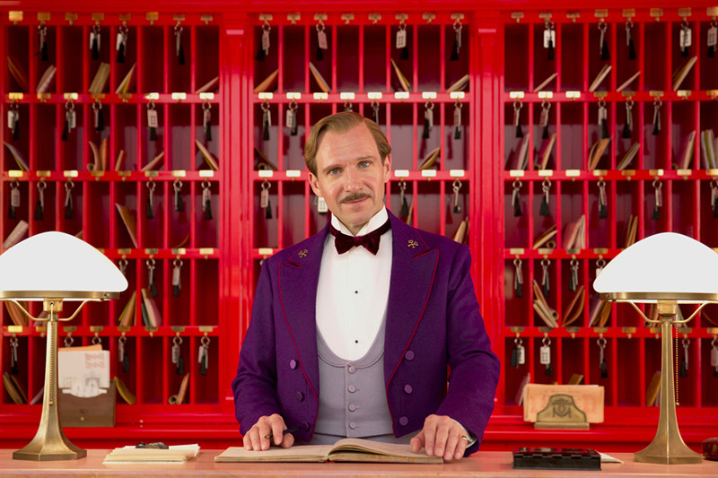
When someone mentions “visually stunning films”, it’s easy to associate this with films that lack real content, and instead are based mainly on images without portraying anything truly significant. The fact that these films are so relevant visually doesn’t mean that they don’t still tell a great story.
In fact, most of the films here are also considered some of the best from the last four years, and with reason. The wonderful collaborations between these directors, cinematographers, production, art and costume designers, colorists, etc., are most often built around a story, working towards the best ways to capture and express it in order to make fantastic and overwhelming visual experiences.
Over the last few years, a lot of filmmakers have been coming up with completely distinct storytelling formats, experimenting and toying with unusual mediums and styles. Featuring some of the most awe-inspiring American Indies and Hollywood films, and a few foreign films and collaborations, here are the 25 most visually stunning films from 2010 to 2014 – in no specific order.
Note: While there aren’t any references from the year 2010, last year gave us too many visual wonders and therefore occupies almost half of this list – thankfully.
1. Her (2013)
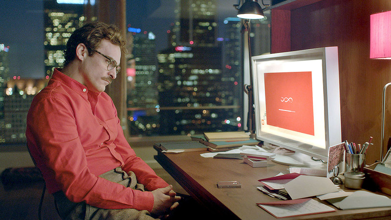
In a film with such a strong idea and narrative, cinematographer Hoyte Van Hoytema had the task of making the visual storytelling almost as important.
The color scheme is one of the most interesting features he brought to the film. Being set in the future – although not so distant – and so relevant in terms of portraying technology, the color blue would be an obvious choice. Instead, Van Hoytema dismissed said color completely and created a warm environment, underlining the fact that “Her” surpasses such genres, and used minimal lighting and LEDs to add color to certain scenes.
By knowing how to adjust himself to the director – Spike Jonze, who is highly experienced in creating the mood for metamodernism -, the film gained a smooth and serene quality that brought out the most emotionally captivating aspects of the story.
2. Laurence Anyways (2012)

One of the most interesting things about Xavier Dolan’s cinematography is that it is hardly his focus at all. By bringing more attention to the actors and the dialogue, his camera is left to linger on them – leaving it almost to chance, while still making beautiful shots, complements his narratives.
His engagement with LGBT themes and imagery urge him to combine exhilaration and emotional intimacy. Being visually witty no matter how hard he tries, Xolan and cinematographer Yves Bélanger choose unusual approaches to specific scenes, giving emphasis on the portrait of the main character, specifically through immense layers of investment.
Assigned as one of the – if the not THE – main queer filmmakers to watch out for, in less than five years since he first started, there are already inherent qualities attributed to his films, being sleek and empathetic, but full of complexities that aren’t too far from surrealism. Pushing constant boundaries and other parts of his aesthetic are easily confused with overbearing, lasting for almost three hours but acknowledging queer characters in a stunningly simple style.
3. Melancholia (2011)
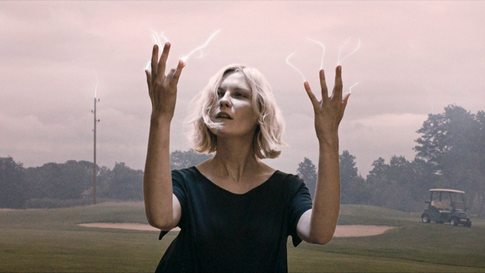
Provocateur and visual poet Lars Von Trier brings “Melancholia” in true art-film shape, regarding an approaching rogue planet that is about to collide with Earth.
His original inspiration was his own story of depression, how this mental illness can so easily make it seem like a person remains calm even amidst chaos. Following “Antichrist” and followed by this year’s “Nymphomaniac”, his second entry in the unofficially titled “Depression Trilogy” relies on sound and music above any other of his projects, using Wagner and combining him with aesthetics of Nazi Germany as metaphors.
Chilean cinematographer Manuel Alberto Claro helps further push boundaries with fluid compositions, spontaneous handheld camerawork and lighting that makes the end of the world seem sophisticated.
A prime example in the mixing of style and substance, von Trier depicts beautifully – once again – a controversial and difficult subject, keeping the audience mute for long after the film’s end.
4. The Great Beauty (2013)
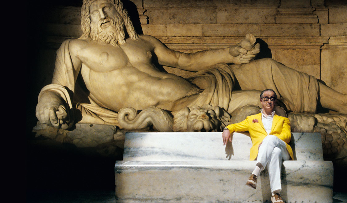
Even as a popular director, this has become Paolo Sorrentino’s most famous film, its popularity growing along with its cinematography. What differentiates this work from so many other visual poems is that it really bothers to reward the audience with rich context, achieving more by complementing image with contemporary Rome in a timeless style.
Considered a reinvention of Fellini’s “La Dolce Vita”, it captures the city like it hasn’t been done in recent memory. The details help making it unique, too, and the near three-hour film gives just enough time for the audience to fully comprehend how meticulously it was done, especially in the hands of cinematographer Luca Bigazzi – who continues to use tilting and panning at the same time as a common feature in Sorrentino’s films.
5. Frances Ha (2012)
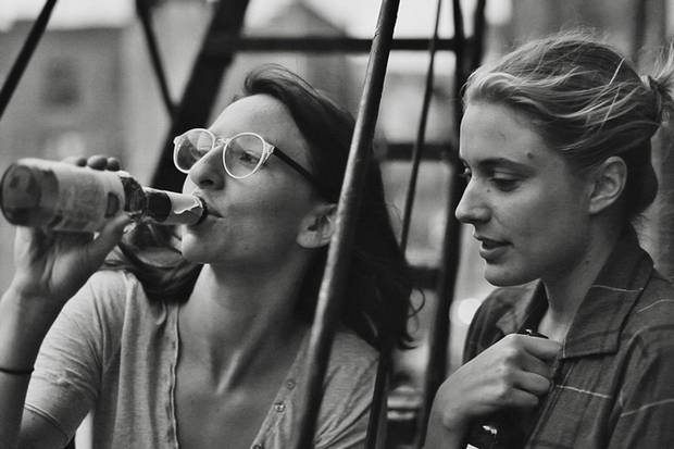
Director Noah Baumbach’s debut in digital filmmaking is a monochromatic experience. With a small crew and minimal equipment, shot in subdued black and white, Baumbach followed the production style of the French New Wave.
Using the Canon 5D as a tool, experienced black-and-white cinematographer Sam Levy (also known for his work in “Wendy and Lucy”) adjusted the camera’s midtones and gave weight to its inherent video noise, resembling actual film grain. This makes more sense given that the director typically enjoys visual spectacles and natural-looking images, therefore not minding the 5D’s imperfections and enjoying the sometimes underexposed scenes. There were a lot of consequences, mostly the amount of time spent studying how the camera would work with different lighting elements and textures.
While this is a great film to look at, the fact that Baumbach used black and white meant he wouldn’t have to worry about color temperature aspects, certain shades, etc., which made for both practicality and to give emphasis to the story, making it an even more sensitive comedy.
6. Blue Is the Warmest Color (2013)
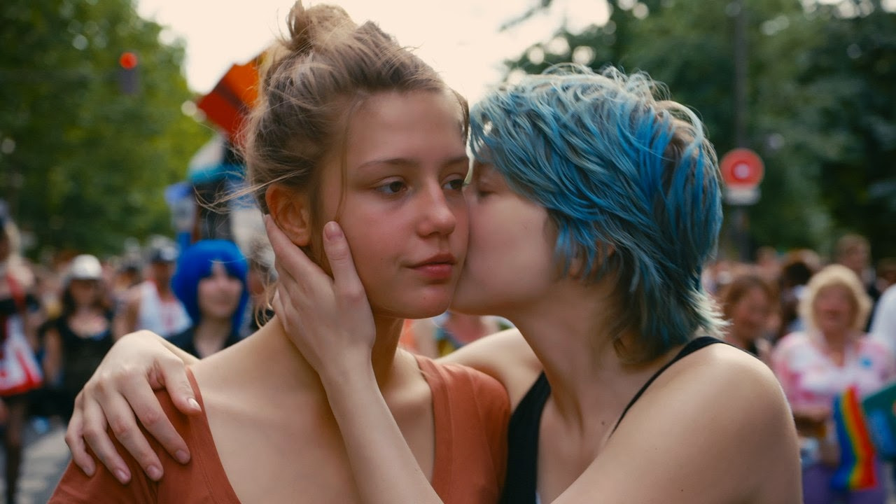
In this film, it was essential that the visuals reflected the various stages of falling in and out of love. The continuous hand held shots follow the characters around like a documentary piece, and the constant use of close up shots are not only used to get the audience’s attention, but to better portray emotions – which on its own is wonderful to watch.
Light is very natural, as mostly windows and doors are used as sources. The English translation of the title has a bigger motif: it’s common sense that blue is usually a “cold” color, and never used as a representation of love. There’s a deep connection between this fact and how the narrative plays out, when it’s used in so many elements involving the two main characters.
We see this color – primarily associated with positive things in the beginning – vanish as the mood of the film becomes darker and problems and doubts arise. Loaded with symbolism and powerful cinematography, it is one of the most visually singular films in recent memory.
7. The Tree of Life (2011)
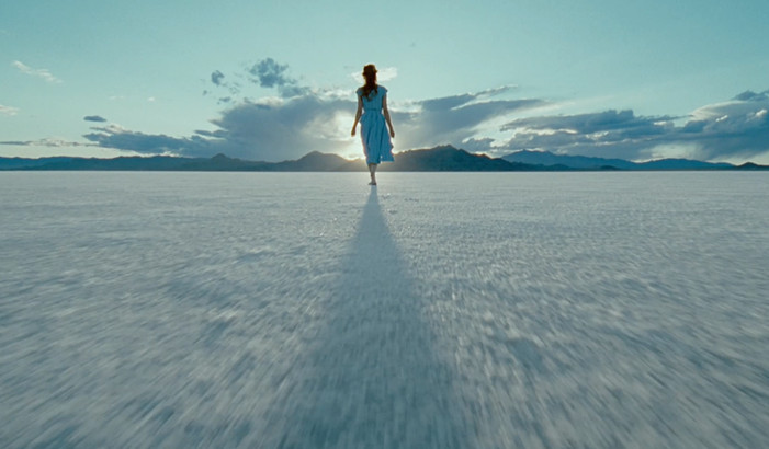
Terrence Malick is a known artist, a philosopher turned filmmaker that focuses on style and turns into substance. Over the years, his work has become an inspiration for young filmmakers, though most fail miserably in achieving the same. Even the more shallow “To The Wonder” (2012) was equally magnificent, but didn’t impact quite as much.
The chosen DP was cinematographer Emmanuel Lubezki, who used very little lighting besides natural light. He even mentioned that if they were inside a house and the lighting wasn’t working, Terrence would rewrite it and make it outside or shoot it another day when it was sunnier.
It also helped that they installed windows in specific places, becoming the main sources of light. Using a mix of 35mm film and regular 65mm, Malick’s need to express himself through stunning images results once again in a cinematic marvel, exhilarating and epic, while telling the dramatic story of a Texas family.
8. Gravity (2013)
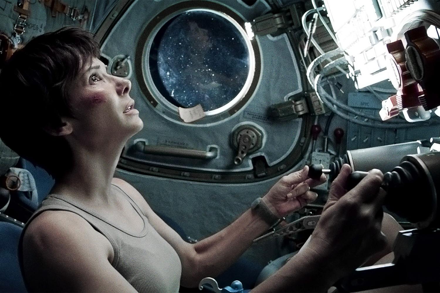
Instead of the usual film stock, cinematographer Emmanuel Lubezki opted by the digital and proved himself again as one of the best in the business. Even though almost everything on screen is fake, the CGI and everything about it is impressive. The complex junction of paradox realism and animation techniques made Alfonso Cuarón (director) and his team pre-visualize the film shot-for-shot way before starting to film.
Lubezki, and his talent for lighting, made being in space seem natural through the use of sun as main light source, with deep shadows and high contrasts. Contributing to the sucessful visuals was also the fact that he created a box with a LED screen, and the actors were shot inside it while projecting the backgrounds of the scenes and giving them visual references for acting.
The camera never stops moving, floating around the characters and giving the impression that it is also lacking gravity, angles pivoting fully through three dimensions. While we can argue whether or not it is a good film, it certainly is a stunner.
9. Weekend (2011)
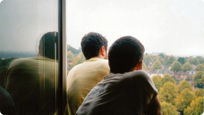
Relying on handheld camera movements, director Andrew Haigh and director of photography Ula Pontikos use a fly-on-the wall technique that manages to perfectly capture intimacy. What makes it stunning is just how easily it seems that the viewer is spying on the characters, like intruders of extremely private moments and conversations. Some angles are obstructed, there are images of the surroundings and seemingly unimportant shots that make for a more realistic atmosphere.
The low budget aesthetic, being shot with a Canon 5D, offers some limitations such as noise and inconsistent light, but it’s not distracting and it adds up very well with the simple and naturalistic color palette, and particularly well with the chosen shooting style – which does the often hard job of complementing such a passionate and powerful content. This is even more worth noting when you have in mind such low production costs.
10. The Grandmaster (2013)
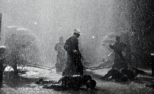
A journey that took 3 years, directed by Wong Kar Wai with the help of French cinematographer Philippe Le Sourd – who made it into a constantly vivacious arty picture in every scene. Whether it was a calm scene, a lingering one – so common in Wong Kar Wai’s films – or an exhilarating fight, it was every bit of remarkable. This wasn’t easy to achieve, as the DP had to go to China to work on the film, having to carry a translator around set all the time and ignoring the fact that there was no script for him.
It’s specially hard when you want to properly capture martial arts in the way Le Sourd did, perfect timings and using certain elements to create shadows and movements, that deeply impacted the story. There were also interesting things to consider, such as fight choreographies, mixing slow with high speed, and giving out the feel that it’s a Wong Kar Wai film even with a different-than-usual cinematographer. His universe and his influence are present and it’s a great representation of why he’s so good.
11. The Grand Budapest Hotel (2014)
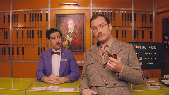
The result of yet another collaboration between Robert Yeoman, ASC, and director Wes Anderson: there’s the obligatory illustrative style that stylistically combines theatre and cinema with complex tales, while being compositionally specific about every shot. Obviously, one could also mention other recent works of these two, such as Moonrise Kingdom (2011), but The Grand Budapest deals with a whole different set of visual experimentations.
For example, there’s a variety of aspect ratios to consider, most notably the Academy ratio (4:3) used in all of the 1930’s scenes of the film, an almost square frame; the panorama-like format known from other Anderson films, used in the 1960s scenes; and the most common format in use today, the 1.85:1 ratio, for scenes taking place in the 1980s.
Also interesting features are the use of analog for most of the film’s action, natural light whenever possible, and lamps. The main use of a single camera only brings more relevance to the long dolly moves and swish pans so familiar in Anderson’s work and, of course, you can’t miss the unbelievable color palette.
12. Nebraska (2013)
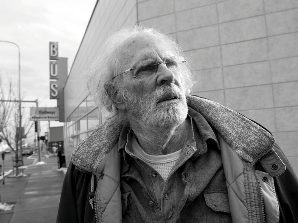
From the beginning of production on this film, cinematographer Phedon Papamichael wanted it to be in black and white. Being a character-driven film, there was a need to make it as visually unique and interesting as possible, so at first he thought of shooting in B&W 35mm film. This didn’t work out because, as wonderfully as it would look, shooting in black-and-white is still seen in several markets as antiquated. He skirted this by first testing color stocks and digital cameras with the help of his colorist, in order to make it as similar as possible to the Kodak film aesthetic.
Shot on location across the American Midwest added sensitivity, but it’s consistency that makes it truly unique. Having always envisioned “Nebraska” in black and white, the responsible filmmakers’ only real excuse for this was that some stills are better in monochrome,and the story and landscapes “lend themselves to black and white”, according to Papamichael. Some interesting choices that worked and perfectly captured the feel of the film.
13. Life of Pi (2012)
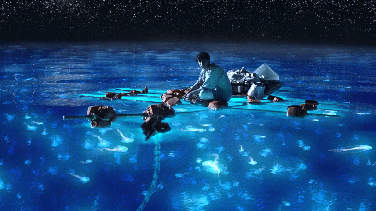
This technical marvel considered by many the most beautiful film of 2012 does very little in terms of actual pure cinematography. While it was unfilmable, Ang Lee made sure it only appeared so, with overwhelming achievements in computer animation and making it a visually stunning film to say the least.
The entire experience is more of a visual wonder than anything else, so it’s a natural contender here. The film’s most unique creation, the tiger, was completely brought by computer-generated effects. Lee knows exactly how to work new ground and still take the most advantage of it, always knowing how and when to employ jaw-dropping CGI, letting the camera float below the surface of water as if it is also lost in the ocean. This gift to photography and computer animation is as good as it gets in the 2010s, and still a must-see.
14. Elena (2011)
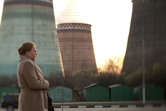
Andrey Zvyagintsev, one of the best filmmakers to come out of Russia, made “Elena” his finest creation to date. Strikingly different, this bittersweet and comic representation of the spiritual and moral corruption in present-day Russia is excelled with the help of cinematographer Mikhail Krichman.
Besides strong content and serious commentaries on modern Russian life, the chosen elements placed throughout the film are filled with unmistakable metaphors, mostly representing survival at any cost. The camera seems to constantly hover the scene, watching, and the aesthetic seems to favor the ambient sounds, a stylization of quiet moments that is typically associated with Russian cinema. Arguably one of the most stunning film experiences in 2011.
15. Only God Forgives (2013)
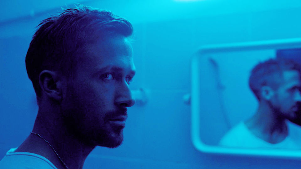
Director Nicolas Winding Refn seems to give priority to the atmosphere and style over matter, being one of those films able to divide an audience completely. The most peculiar aspect of it is probably how much it feels like someone’s constantly taking a photograph in each scene, with perfect lighting and even actors’ positions, making for a dazzling composition.
Larry Smith does his second collaboration with Refn as his cinematographer, and brings out specific elements that are becoming more relatable to him: the one-light-set-up, gorgeous use of on-set lights, theatrical ambient, strong shadows and, specifically, colored filters on light.
Red gels filter various scenes in order to recreate Bangkok – along with blue – coexisting in neon bright scenery and vibrating with the city’s violence and eroticism. Take note of Smith’s signature lense care: soft borders and transitions, warmer skin tones and, of course, all with the octagonal iris.
16. Spring Breakers (2012)
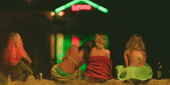
The extreme talents in charge of this ironic testament to postmodern times are cinematographer Benoit Debie and director Harmony Korine. Korine found in Debie – also responsible for the hyperrealist “Enter the Void” (2009) – someone who could perfectly depict the degradation of culture.
The bubblegum, candy and colorfully insane tone worked wonders in representing the theme of the film: a culture of surfaces. Benoit Debie’s camerawork further portrayed this through a variety of filmstocks and formats, slow-motions and dubstep-infused shots.
Even though the music, the strong connections to pop depravity and the rawness of some of the footage make a strong impact on viewers, the overall visually ravishing sequences are almost a character in the film. As shocking and violent as the narrative, the pink neon glow and balaclavas stay with us even after the film ends.
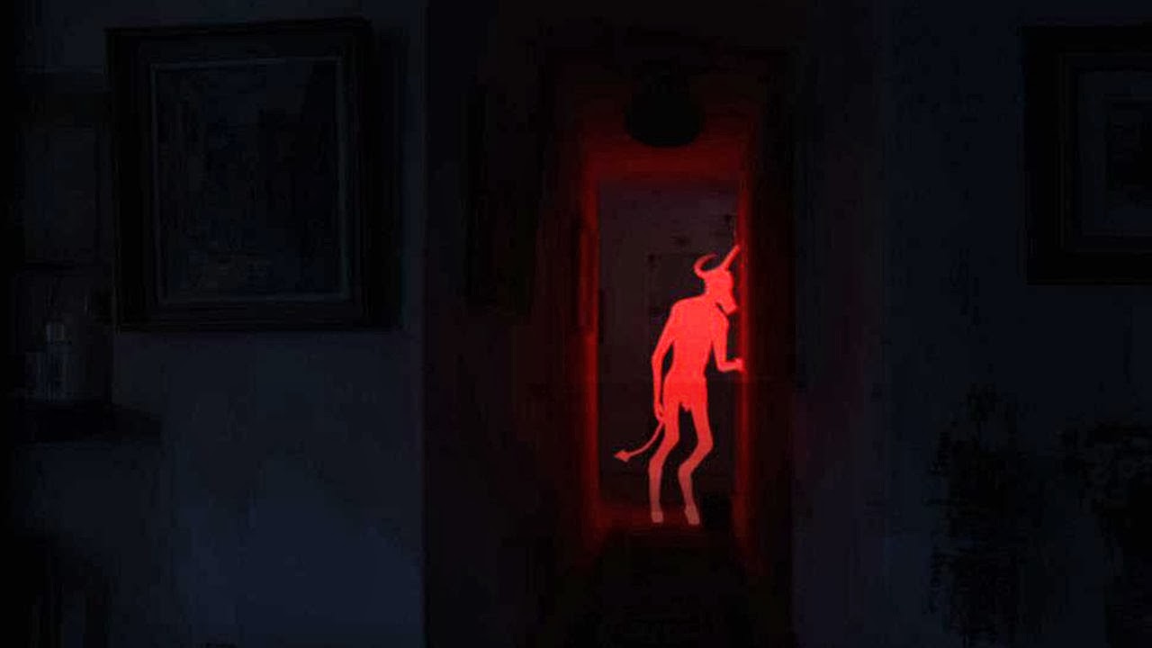
17. Stoker (2013)
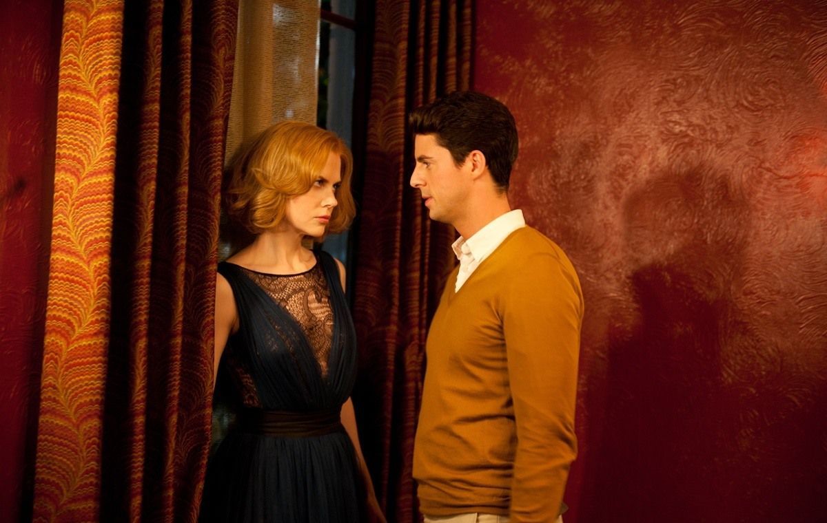
South Korean director Park Chan-wook’s first English-language film presents us with another example of why the filmmaker likes dark narratives and mysterious characters, making them as clean and stylish as possible. With usual collaborator Chung Chung-hoon, who first worked with Park in “Oldboy”, they managed to place little lights in order to keep from having totally dark areas, controlling contrast mainly on set and trying to stick coloring to the basics in order to get as much advantage possible when editing.
By creating an unsettling and overall disturbing environment, the story becomes what we see, even despite the strong hints of symbolism and Hitchcock-influences. The camera work, overflowing with dynamic, and the groundbreaking cinematography are incredibly haunting: everything related to it makes “Stoker” an unforgettable twisted family drama, whose main problem is that it demands full attention in order to connect the dots. While not being as good as other Park Chan-wook films, it’s still beautiful entertainment.
18. Post Tenebras Lux (2012)
Mexico has been coming up with some very interesting visuals in the past few years, and this is yet another example of that. Notably influenced by fellow Mexican Emmanuel Lubezki and his collaborations with Terrence Mallick, comes director Carlos Reygadas. His regular DP is Alexis Zabe and, luckily so: Zabe does a great job, particularly in this film, by mixing the lyrical and the plain odd as if they belonged together. The long-take style so typical of Reygadas can be seen here again with his taste for first-time actors. He has admitted that people ask him: “Is it just a collection of images?”
The fact that it is filled with natural beauty, astounding shots of a jungle, the sea, etc., doesn’t mean that it’s supposed to be light and less dramatic. It wraps around our mind until we fully understand the complexity of what we’re seeing. Whenever there’s an exterior scene, the edges around the screen are blurred – and somehow it appears as if it’s extremely meaningful to the story.
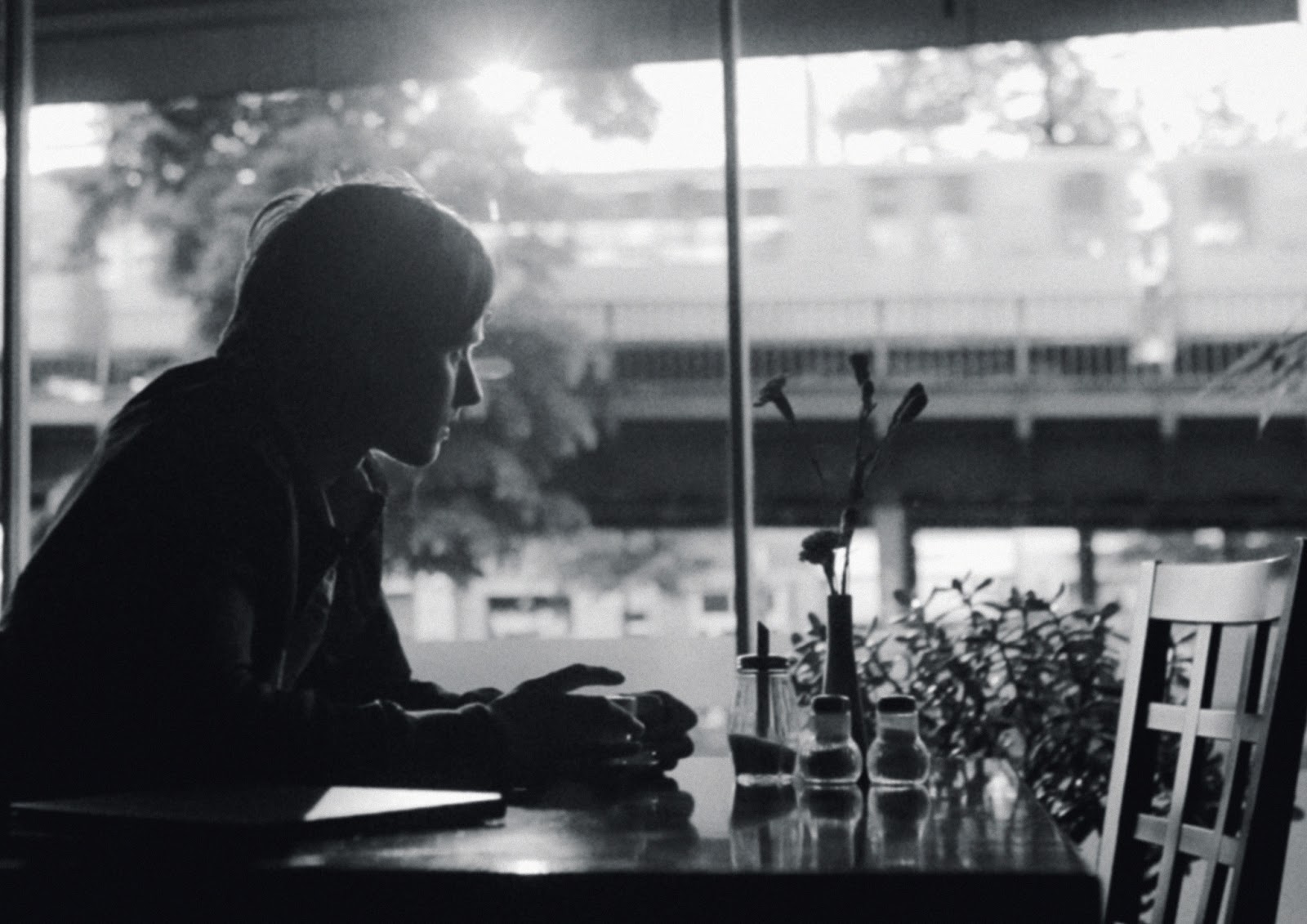
19. Inside Llewyn Davis (2013)
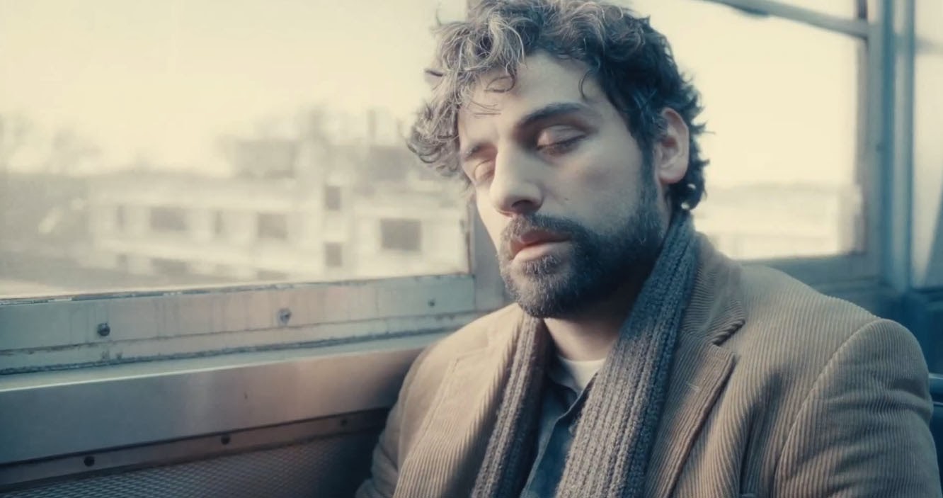
The first thing anyone notices about this film, in a way that surely distinguishes itself from all other films on this list, is its truly unique color palette, a washed out effect plastered in the entire film. Thanks to DP Bruno Delbonnel, the visuals tell the story of exactly how Llewyn sees the world. There’s so much emphasis on the visualization points that it’s almost as if the rest is only a consequence of it. The representation of loneliness and helplessness is in the lack of light, and everything else seems as if folk music was a picture.
The acclaimed DP, most known for his work on “Amélie”, personally wanted to have something sad throughout the film, so he chose to use the same light to light both the actor and the set, making it constantly fall off to darkness, keeping the fill levels at a minimum.
It’s kind of a testament to Roger Deakins, the Coen’s regular cinematographer, but with a psychological angle that adjusts to the directors’ iconic humor and mannerisms without actually communicating much with him about it.
It’s kind of a testament to Roger Deakins, the Coen’s regular cinematographer, but with a psychological angle that adjusts to the directors’ iconic humor and mannerisms without actually communicating much with him about it.
20. The Master (2012)
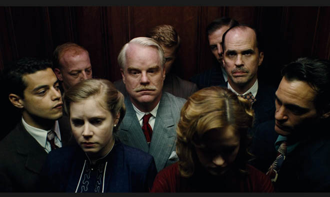
Paul Thomas Anderson (PTA for short) has admitted his wish to recreate the look of classic films such as “Vertigo” and “North by Northwest”, therefore testing some Panavision equipment (65mm cameras) for this film, when eventually it all started coming together very clearly to him.
The format fit the story, and it seems the film was shot in a “let’s keep trying” way – which worked until it was almost finished. For longer, more intimate sequences, PTA and cinematographer Mihai Malaimare Jr. confirmed filming in 35mm, trying to delicately juggle between formats without being too noticeable.
The use of film almost automatically means greater image area and emotional depth on the screen, drawing viewers further into the story. It’s an all-around gorgeous movie, wonderfully using a color palette straight from 1950s America, and the montage rhythm couldn’t be more tumultuous and narrative driven.
21. Ida (2013)
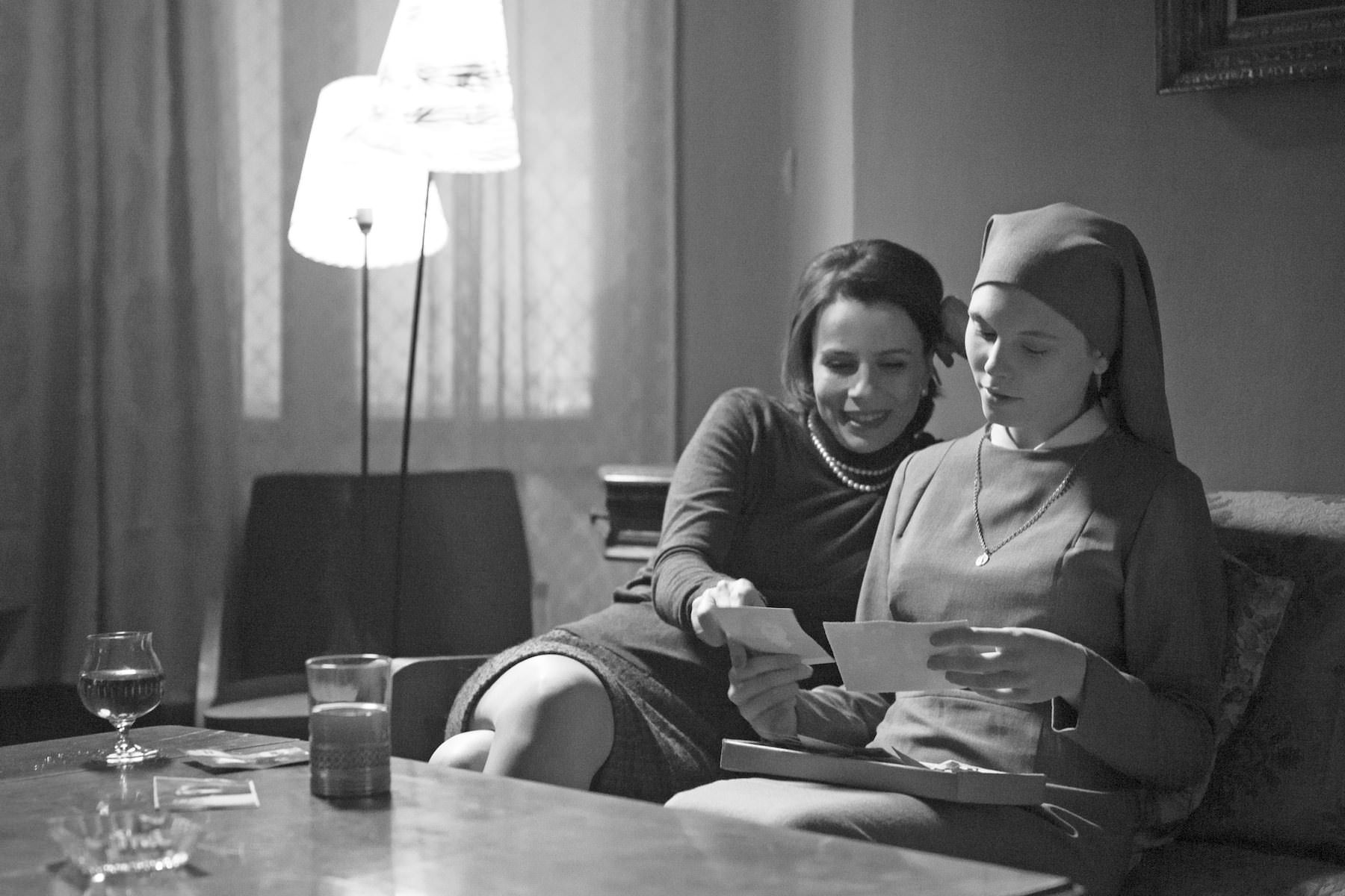
This film is a beautiful puzzle right from the start. Pawel Pawlikowski and his usual cinematographer Ryszard Lenczewski tell the story of a nun through black and white photography, perfectly adapted to the spirituality portrayed. Despite being shot on video, every other detail is designed to achieve a silent film feel, with a mood and images so beautiful that one can easily get lost in them. They managed to capture the main character with incredible fluidity through camera work, advantageous lighting and framing, and meaningful focus on contrast – almost a study-case of the latter, actually.
It’s a rich film, quiet but intense, incredibly emotional and a breakthrough when it comes to experimenting with aesthetics from the 1950s and 1960s – which make perfect sense in this particular film. The handheld camera, persistence in close-ups and breathtaking imagery make for an overall masterful work, one that will easily stun any kind of viewer.
22. Oh Boy / A Coffee in Berlin (2012)
This German film, seriously reminiscent of “Frances Ha” from thematic components to the black and white, tells the story of Niko, who dropped out of law school yet still accepts his father’s funding without informing him he’s no longer being schooled. It features some issues from the younger generation, irresponsibilities and uncertainties regarding the future.
Cinematographer Philipp Kirsamer films Berlin in its urban glory, making Niko seem incredibly lost among an endless flux of people, busses, trains, subways, while making it obvious that it is a city in transition. The modernities and buildings contrast with empty spots and constant constructions, making it the perfect metaphor for Niko’s struggles in building something for himself while he slowly matures.
Aiming at current realities, such as financial dependence and general frustration, Kirsamer and director Gerster move the camera as if it is the very representation of Niko’s emotional states – whenever Niko’s moving fast towards something, the camera can hardly keep up with him. Being quintessentially indie, it’s not surprising how much critical acclaim it got in Germany, and it’s certainly one of their best in the last few years.
23. Upstream Color (2013)

The first thing anyone should know about this film is that it was written, directed, produced, edited, composed, designed and cast by Shane Carruth. He also co-stars in it. It’s the ultimate indie film, portraying one person’s view in almost every aspect, including distribution.
Not implying that he was great in every one of his “jobs”, he did make a powerful intimate film, both puzzling and straightforward. This visionary created a language that doesn’t abide by any specific rules: the narrative may be intense and obvious, but then the shot selection is connected to sound, with a very narrow depth of field and an unlikely representation of nature.
The characters are complex and uncertain, but the cinematography draws us so close that it’s impossible to not try to understand it as a whole. While being an apparently subjective experience, it’s densely layered without relying much on dialogue. The obsession with color, textures and movements recall a drug-trip, flawed and mesmerizing.
24. Pina (2011)
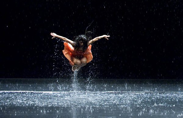
This eccentic work of art is unlike anything else on this list. In a representation of dance and the power of performances, Wim Wenders, Hélène Lovart and Jörg Widmer accomplish a sort of theatrical cinematography that is ultimately jaw-dropping, to say the least.
Everything is wonderfully choreographed, and Wenders makes everyone else who’s directed dance films look bad. Through the use of unique cinematic techniques, mind-boggling close-ups and POV shots, every frame seems to complement the next, with graceful cutting from one piece to the other.
Experimenting with 3D cinematography further underlines his meticulous work in terms of space usage and the physical depth implied – this results in one of the best uses of 3D technology, innovative while extremely appropriate. A whole new experience, relying mostly on visuals, and impossible to miss amongst any of the most stunning recent films.
25. Only Lovers Left Alive (2013)
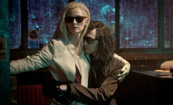
This perverse vampire film is unlike any other, and the cinematography is haunting, making it a visual delight. It relies on the bizarre – being a gothic romance – and French DP Yorick Le Saux (“I Am Love”) gives aesthetic cohesion through composition and costuming, and exceptionally in the camera work.
Being one of the most celebrated cinematographers in the world, Le Saux brings power through guitars, as Tom Hiddleston plays a dead rock star, and manages to make Tilda Swinton look as fashionably dark as possible.
The director, Jim Jarmusch, usually goes for self-indulgent throws at society, making fun of it, but this is almost an ode to his tendency for minimalism, pure and simple while still being tender and spooky at the same time. Adding music and art to the equation only makes it more visually alluring, while still featuring a cynical tone. It throws all vampire movies into a corner, disarmingly poetic and freakishly fascinating.
Author Bio: Alex Gandra is a Portuguese writer and filmmaker.She graduated this year in New Communication Technologies from the University of Aveiro and is currently in a master’s degree in Digital Audiovisual. She spends too much time in cafés writing scripts and other kinds of texts you can find at medium.com/@gandra_le. She’s also writing a book she hopes to finish some day.
Uncle Boonmee
Under the Skin
The Secret Life of Walter Mitty
ENTER THE VOID
Skyfall
Pacific Rim
Lovely Bones
Rush
Helter Skelter
THE GREAT GATSBY
Heartbeats, aka Les amours
Beyond the Black Rainbow
Pans labyrinth
The Fall
Short Term 12
Uncle Boonmee
Under the Skin
The Secret Life of Walter Mitty
ENTER THE VOID
Skyfall
Pacific Rim
Lovely Bones
Rush
Helter Skelter
THE GREAT GATSBY
Heartbeats, aka Les amours
Beyond the Black Rainbow
Pans labyrinth
The Fall
Short Term 12
No comments:
Post a Comment